


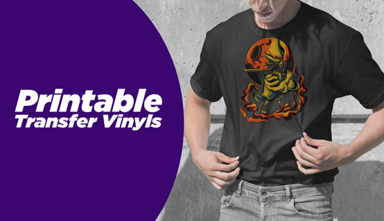


Common mistakes in printing can lead to wasted resources, lost time, and dissatisfied clients. As a knowledgeable print shop owner, it is essential to recognize and take preventative steps to eliminate potential errors. In this blog post, we will delve into some of the most common printing mistakes that even experienced professionals in our business make.
We'll explore the importance of using correct color profiles for an accurate representation of your customers’ artwork. Next, we'll discuss how poor file resolution can result in low-quality grainy print and ways to prevent this issue. Additionally, we'll touch on selecting the appropriate paper size for your projects.
Finally, ignoring bleed settings is another common mistake leading to unsightly design edges. Learn how to set up bleeds for professional-looking results properly. By understanding these common printing mistakes and implementing best practices in your workflow, you can significantly improve the quality of your printed heat transfers, save time and money, and keep your customers coming back. \
1. Overlooking Color Profiles
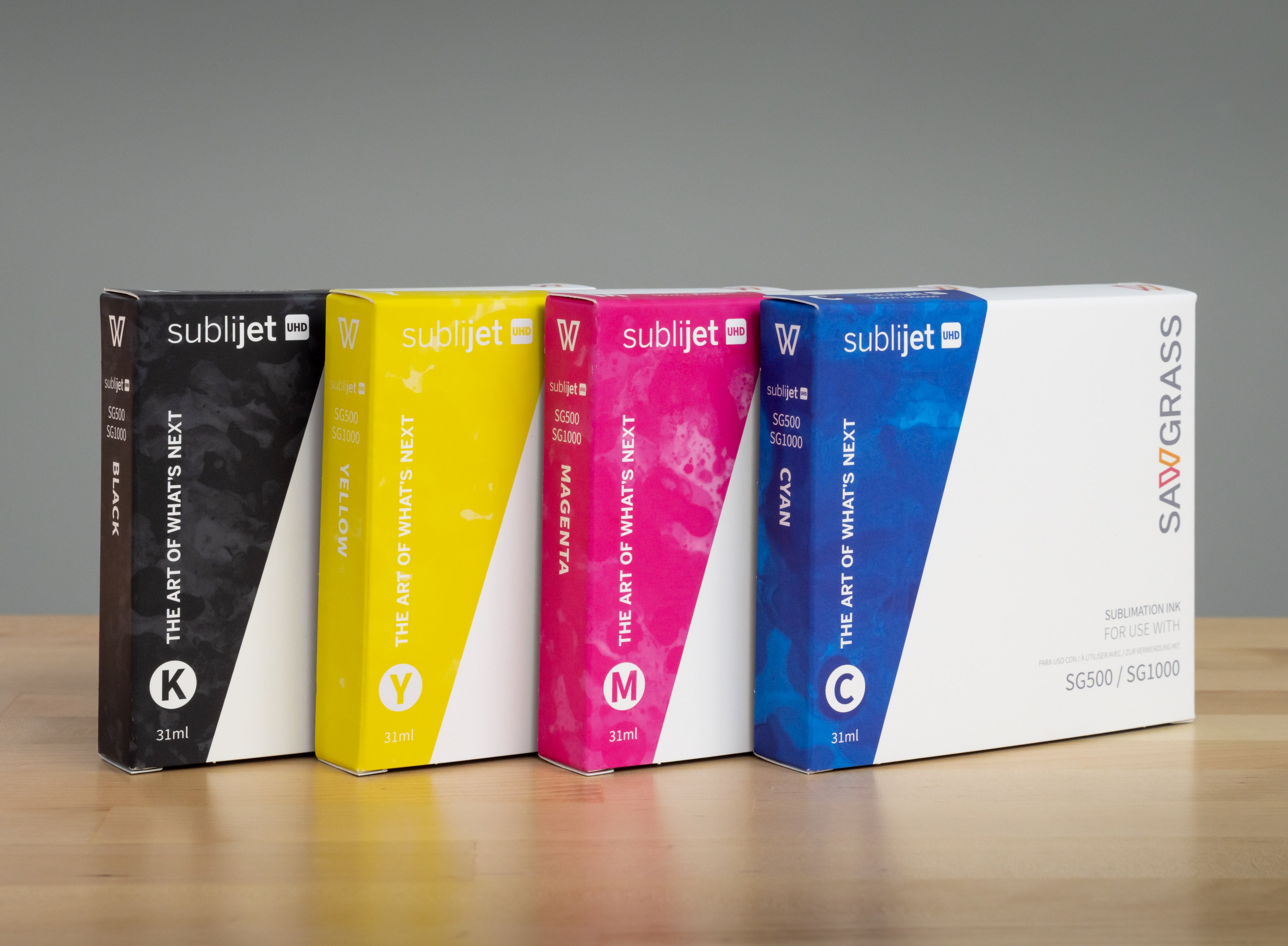
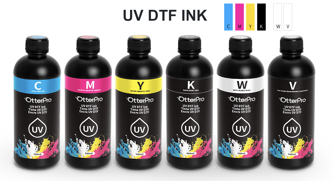
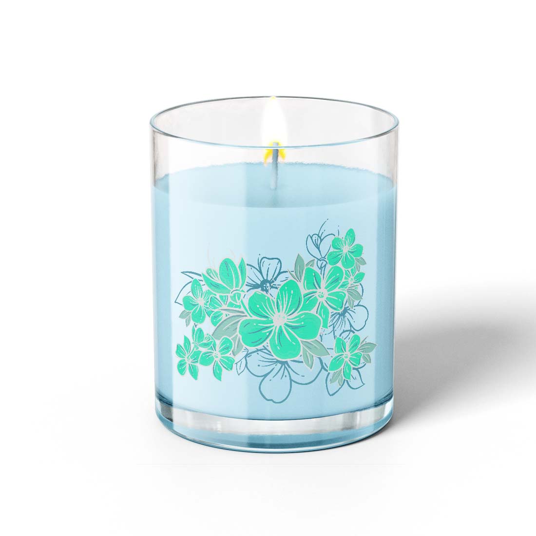
One common printing mistakes is overlooking color profiles, which can lead to inaccurate representation of the original art and poor print quality. Color Profiles define the original colors the camera captures and how we see them on our computer displays. They provide a means of consistency between the original and the finished heat transfer. When it comes to producing high-quality printed heat transfers, using the correct color profile is essential to ensure that your final product matches what your customer wants shirt or substrate.
Very simply, a color profile is a data set that describes how colors should be displayed on different devices, such as monitors or printers. It helps ensure consistency across various platforms by providing a standard way to interpret and reproduce colors accurately. sRGB is the color profile that you will encounter in most of the images you get from your customers. Most computer monitors are deigned to display a significant portion of the colors in this profile. The Adobe RGB profile is another you might encounter. Adobe RGB displays a wider range of the visual spectrum and is mainly used by professional photographers. While most new digital cameras can capture the full range of colors in Adobe RGB only expensive computer monitors can display them. I am sure you have seen the color bullet with the triangle inscribed inside to indicate the range of color the process can display. Remember, sublimation and transfer printing does not have the same ability to duplicate the same range as the human eye.
The Importance of Using the Correct Color Profiles
- Color Accuracy: A proper color profile ensures that the printed output closely resembles what you see on the screen, reducing discrepancies between digital designs and physical prints.
- Better Print Quality: Using an appropriate color profile allows for more accurate reproduction of gradients, shadows, highlights, and other elements within an image or design file.
- Fewer Reprints: Ensuring consistent results from one print job to another reduces waste caused by reprints due to incorrect coloring or inconsistencies in appearance.
Tips for Choosing the Right Color Profile
- Determine Your Printer's Capabilities: Consult your printer manual or manufacturers website for information about supported color profiles specific to your device model.
- Select Appropriate Software Settings: In programs like Adobe Photoshop or Illustrator, Inkscape, and Affinity, choose the right working space (e.g., sRGB) based on your intended output device (monitor vs. printer).
- Create Custom Profiles: For more advanced users, consider creating a custom color profile tailored to your specific printer and paper combination using software and a color calibration tool.
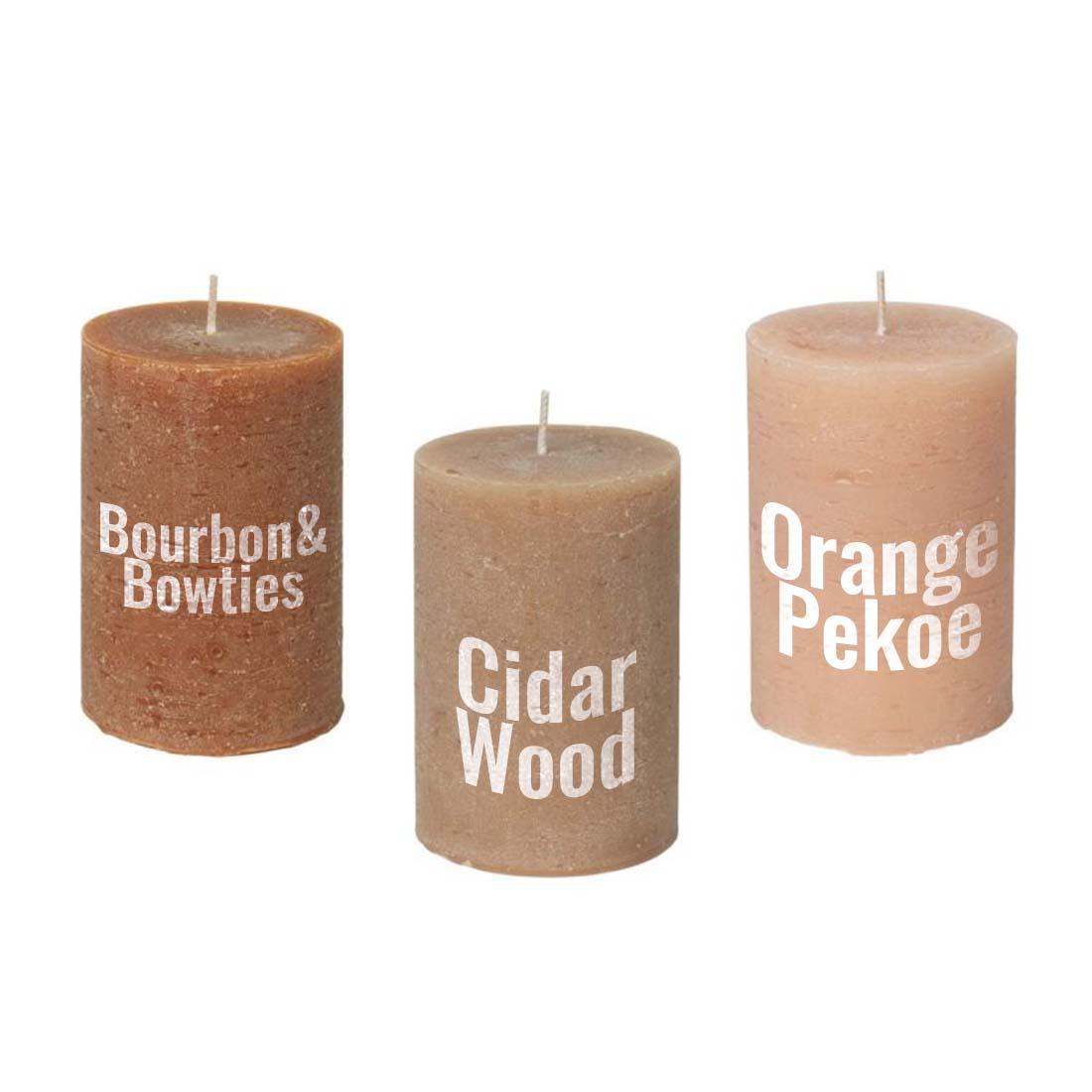
- Make sure you have a Pantone® Color Formulation Guide (Coated and Uncoated) or book in the workplace and that you use it when working with customers on color. Customers with registered logs will require a color match. Guide them to the Pantone® sGuide to pick out their color. Make sure you use the uncoated part of the Guide. The coated colorswillnot be a good representation of heat transfer printing.
- Consistently Apply Color Profiles: Ensure that you apply the same color profile across all design files for a project to maintain consistency in print transfer results.
- If your customer demands accuracy in the output, you create make sure you have calibrated your monitor to ensure that what you see on the screen is what you are going to get when you print the heat transfer. The process of insuring you have a calibration involves software, a densitometer, and a monitor screen calibration device. X-rite Pantone® are the color professionals.
Incorporating proper color profiles into your printing process is crucial for achieving accurate colors and high-quality prints. By understanding the importance of these profiles and following best practices, small and medium print shops can avoid this common mistake while producing professional-grade materials.
Inaccurate color settings can produce a less-than-desirable outcome, so it is essential to be attentive to this detail. Obtaining the optimal resolution in the heat transfers you produce is essential; fortunately, there are steps you can take to make sure they appear perfect.
2. Poor File Resolution
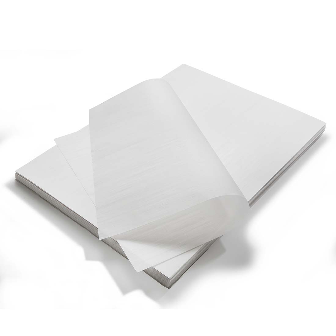
A poor file resolution can lead to a lack of clarity and sharpness in printed images, thus reducing the quality of the final product. To ensure your printed heat transfers are of the best quality, it is important to be aware of file resolution and use high-resolution images
Understanding File Resolution
File resolution is typically described with two terms: DPI and PPI. The terms are frequently used interchangeable. However, they should not be. PPI describes the resolution of a digital image whereas DPI describes the number of ink dots on a printed page. The higher the PPI/DPI value, the more detail and clarity an image will have when printed. For professional print quality, it's recommended that you use a minimum resolution of 300 DPI when you print heat transfers.
Tips for Ensuring High-Quality Images
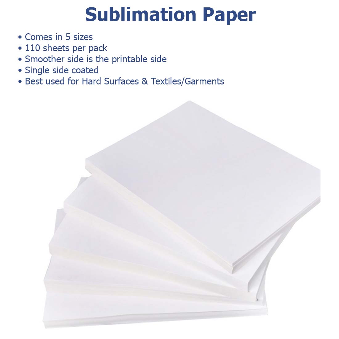
- Select appropriate file formats: Use lossless file formats like TIFF or PNG whenever possible since they retain all original image data without compression artifacts often found in JPEGs.
- Avoid enlarging small images: Enlarging a low-resolution image will only make its imperfections more noticeable. Instead, try obtaining a higher-resolution version of the same image from its source or consider purchasing stock photos from reputable providers such as Shutterstock.
- Edit carefully: When editing images for print projects, always work on copies rather than originals. That way, if you accidentally make a mistake, you can go back to the original and the risk of multiple saves and edits which can lead to poor image quality.
- Preflight check: Before sending your files off to the printer, perform a preflight check using software like Adobe Acrobat Pro DC to identify any potential issues related to resolution and other aspects of print readiness.
Maintaining high-quality images is crucial for producing professional-looking printed materials. By understanding file resolution and following the tips above, you can ensure that your print projects will look their best every time.
It is essential to ascertain that the files you employ possess an adequate resolution, as a low quality of file may result in a dissatisfactory print. Moving on, incorrect paper size is another common mistake in printing which should be avoided.
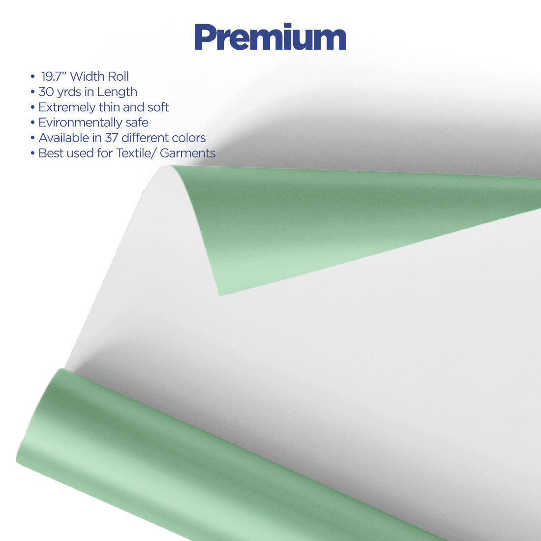
3. Incorrect Paper Size
Using the wrong paper size for a project can cause problems with alignment and margins, leading to an unprofessional final product. To avoid this common mistake in printing, it's essential to understand the different paper sizes available, as well as how to set up your print job correctly.
Global paper sizes such as A-series (A4, A5), B-series (B4, B5) and US Letter (81/2 X 11) or Legal (81/2 X 14) are widely used.
Selecting the Right Paper Size
When selecting a paper size for your print job:
- Determine which paper size accommodates the design layout and content you are going to print. Keep in mind that the working area of a garment is typically:
- Adult T-Shirt is about 8-13” X 15”
- Youth T-Shirt is about 6-91/2” X 91/2”
- Infant Shirt is about 3”-51/2” X 5”
- Consider any folding or binding requirements that may affect the choice of paper size.
- When it comes to selecting the right size for your project, it's best to confer with customers or associates before moving forward.
Setting Up Your Print Job Correctly
To ensure proper alignment and margins when using the correct paper size:
- Create a custom page setup: In most graphic design software like Adobe Illustrator or InDesign, you can create a custom page/document setup by specifying dimensions that match your chosen paper size. This will help maintain accurate proportions throughout the design process.
- Maintain consistent document settings across files: If multiple files are part of one printed piece (e.g., brochure panels), make sure all documents use identical settings regarding dimensions and units of measurement. This ensures consistency during production at small- to medium-sized print shops.
- Use crop marks and registration marks: Including these guides in your print file can help the printer accurately align and trim your printed materials. Learn more about using crop marks and bleed settings.
Paying attention to paper size selection, as well as proper type setting for your print job, will result in a polished final product that meets both aesthetic and functional requirements and much less hastle.
Incorrect paper size can lead to a variety of issues, from misprints to wasted time and resources.
Key Takeaway: Don't make the mistake of using an incorrect paper size when printing as it can lead to alignment and margin issues. To avoid this, understand the different standard paper sizes available and create a custom page setup that matches your chosen size while maintaining consistent document settings across files. Use crop marks and registration marks for accurate alignment during production.
Common Mistakes in Printing
Printing of heat transfers is a crucial aspect of any personalization business, and it's essential to get it right. However, mistakes can happen, and they can be costly. In this article, we'll discuss some of the most common printing mistakes and how to avoid them.
1. Ignoring Bleed Settings
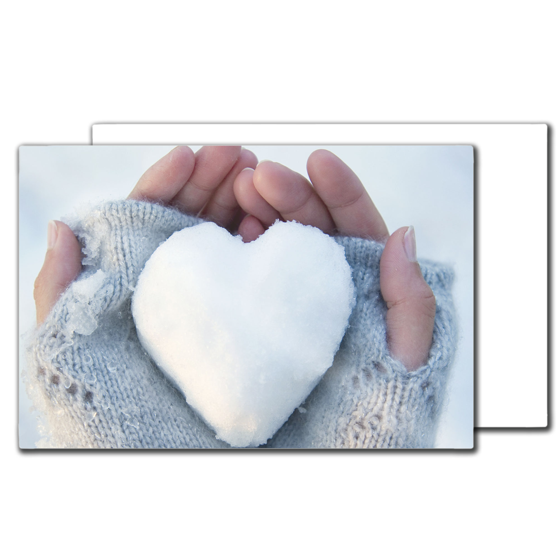
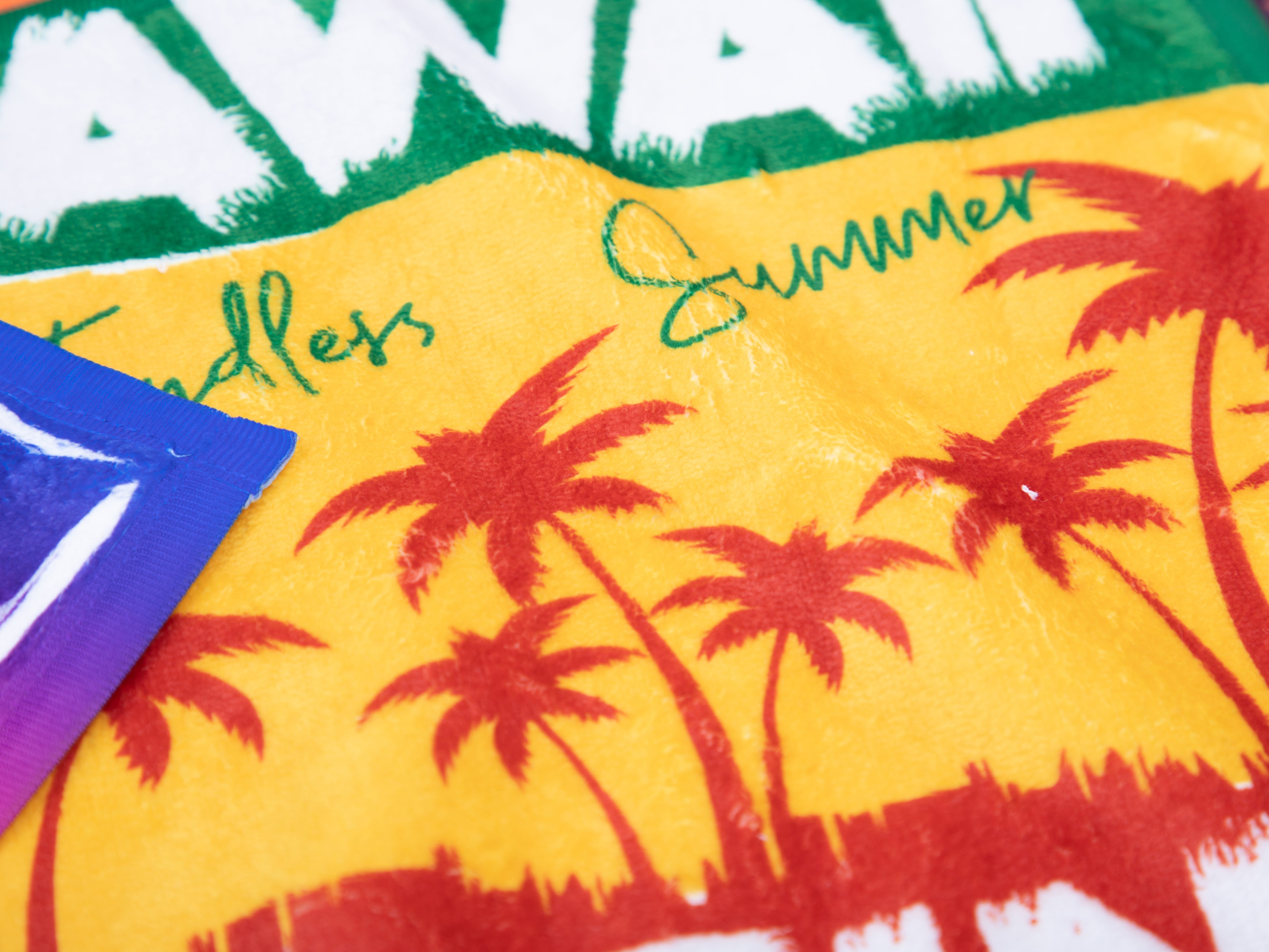
Not accounting for bleed settings when printing can lead to white borders around the edges of the printed material. This common mistake can make your final product look unprofessional and lost on the shirt or substrate, which is not ideal for any print shop looking to maintain a high-quality reputation.
Understanding Bleed Settings
Bleeds are essential in ensuring that your printed materials have a seamless edge-to-edge design without any unwanted white space. A bleed setting refers to an extra margin added around the document's edges, allowing images or colors to extend beyond the trim line during printing. Although you should not expect to have a heat transfer design print off the edge paper. Typically, the excess paper area will protect the surface of the item you are decorating from any itinerant dye that may have built up on the heated platen of your heat transfer machine.
The Importance of Properly Setting Up Bleeds
Importance of Properly Setting Up Bleeds
- Avoiding White Borders: When you don't set up bleeds correctly, there's a risk that your prints will have noticeable white borders along their edges due to slight misalignments during cutting.
- Maintaining Professionalism: Unwanted white spaces on your prints can give off an amateurish impression, potentially damaging your print shop's credibility and customer satisfaction levels.
- Saving Time and Money: Correctly setting up bleeds from the beginning helps prevent costly reprints caused by unsatisfactory results due to improper bleed setup.
Tips for Properly Setting Up Bleeds in Your Prints
- Determine Required Bleed Size: Check with your printer or refer to industry standards (usually between 1/8" - 1/4") to determine the appropriate bleed size for your project.
- Extend Design Elements: Make sure that any images, colors, or design elements that need to reach the edge of your printed material extend into the bleed area. This will ensure a seamless appearance after trimming.
- Use Appropriate Software Settings: Many design software programs like Adobe Illustrator and InDesign have built-in settings for adding bleeds. Familiarize yourself with these tools and use them correctly when setting up your print files.
- Double-Check Your Files Before Printing: Always review your final files before sending them off to be printed. Ensure that all necessary elements are within the bleed area and there are no unwanted white spaces along the edges of your designs.
Incorporating proper bleed settings in every printing job is crucial for achieving professional results.. By understanding how bleeds work, why they're essential, and how to set them up correctly, you can avoid common print file mistakes while ensuring high-quality outcomes for every project you undertake.
NOTE: On sheet feed designs you cannot print over the edge of the transfer paper. In the case, you were going to decorate a small cut part (smaller than the transfer printing paper you would be concerned with bleed….not on the front of a garment using a desktop printer.
2. Poor Design
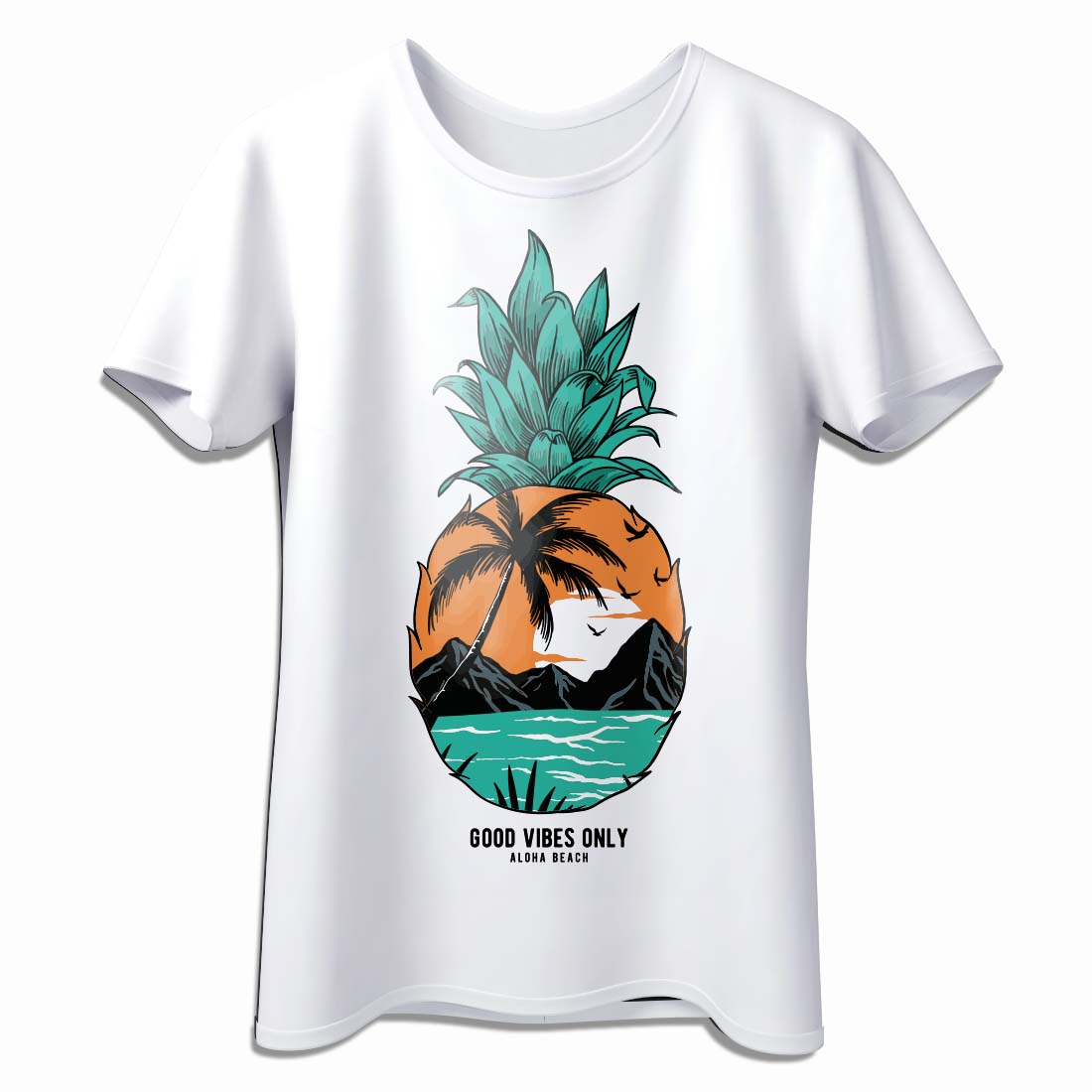
Another common mistake in printing is poor design. A poorly designed print can be unappealing and ineffective in conveying the message. It's essential to invest time and effort into creating a design that is visually appealing, easy to read, and effectively communicates your message.
Tips for Creating a Good Design
- Keep it Simple: A cluttered design can be overwhelming and confusing. Keep your design simple and easy to understand.
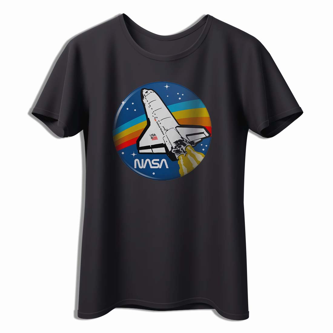
- Use High-Quality Images: Low-quality images can appear blurry and unprofessional. Use high-quality images that are relevant to your message.
- Choose the Right Colors: Colors can evoke emotions and convey different messages. Choose colors that are appropriate for your message and brand.
- Use Proper Font: The font you choose can affect the readability of your design. Use a font that is easy to read and appropriate for your message.
By following these tips, you can create a design that is visually appealing, easy to read, and effectively communicates your message.
3. Incorrect File Formats
Using the wrong file format can result in poor print quality. It's essential to use the correct file format for your project to ensure that your prints look their best.
Tips for Choosing the Right File Format
Tips for Avoiding Spelling Errors
- Vector Images: Use vector images for designs with simple shapes and lines. Vector images can be scaled without losing quality.
- Raster Images: Use raster images for designs with complex details and color gradients. Raster images can be high resolution and provide more detail.
- PDF: Use PDF for transfer that need to be printed at a specific size.
By using the correct file format, you can ensure that your prints look their best and convey your message effectively.
4. Spelling Errors
Spelling errors can be embarrassing and unprofessional. It's essential to proofread your designs before printing to ensure that there are no spelling errors.
Tips for Avoiding Spelling Errors
- Proofread: Always proofread your designs before printing. Use spell check and have someone else review your work.
- Take Your Time: Rushing through a design lead to mistakes. Take your time and double-check your work.
By avoiding spelling errors, you can ensure that your prints are professional and effective in conveying your message and it eliminates returns.
5. Improper Image Resolution
Using low-resolution images can result in poor print quality. It's essential to use high-resolution images for your prints to ensure that they look their best.
Tips for Using Proper Image Resolution
- Use High-Quality Images: Use high-quality images that are at least 300 DPI for the best print quality.
- Resize Images Carefully: Resizing images can affect their resolution. Resize images carefully to avoid losing quality when you blow them up.
By using high-resolution images, you can ensure that your prints look their best and convey your message effectively.
Conclusion
Printing mistakes can be costly, embarrassing and damaging to your business's reputation. By avoiding common mistakes like ignoring bleed settings, poor design, incorrect file formats, spelling errors, and improper image resolution, you can ensure that your printed transfers are professional, effective, and convey your message accurately. Remember, once you have printed the heat transfers you are going to apply them to a garment or other substrate like a ceramic mug. So, the mistake on the heat transfer multiplies in cost.